Brand Identity
Triplemint
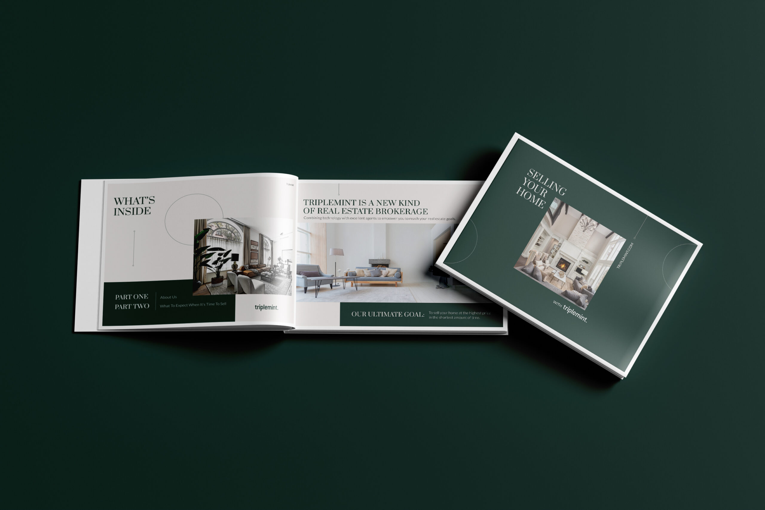
Based in New York, Triplemint provided varied real estate services across the Tri-state area. As a new kind of real estate brokerage, Triplemint combined technology with excellent agents to empower buyers, sellers, and renters to reach their real estate goals.
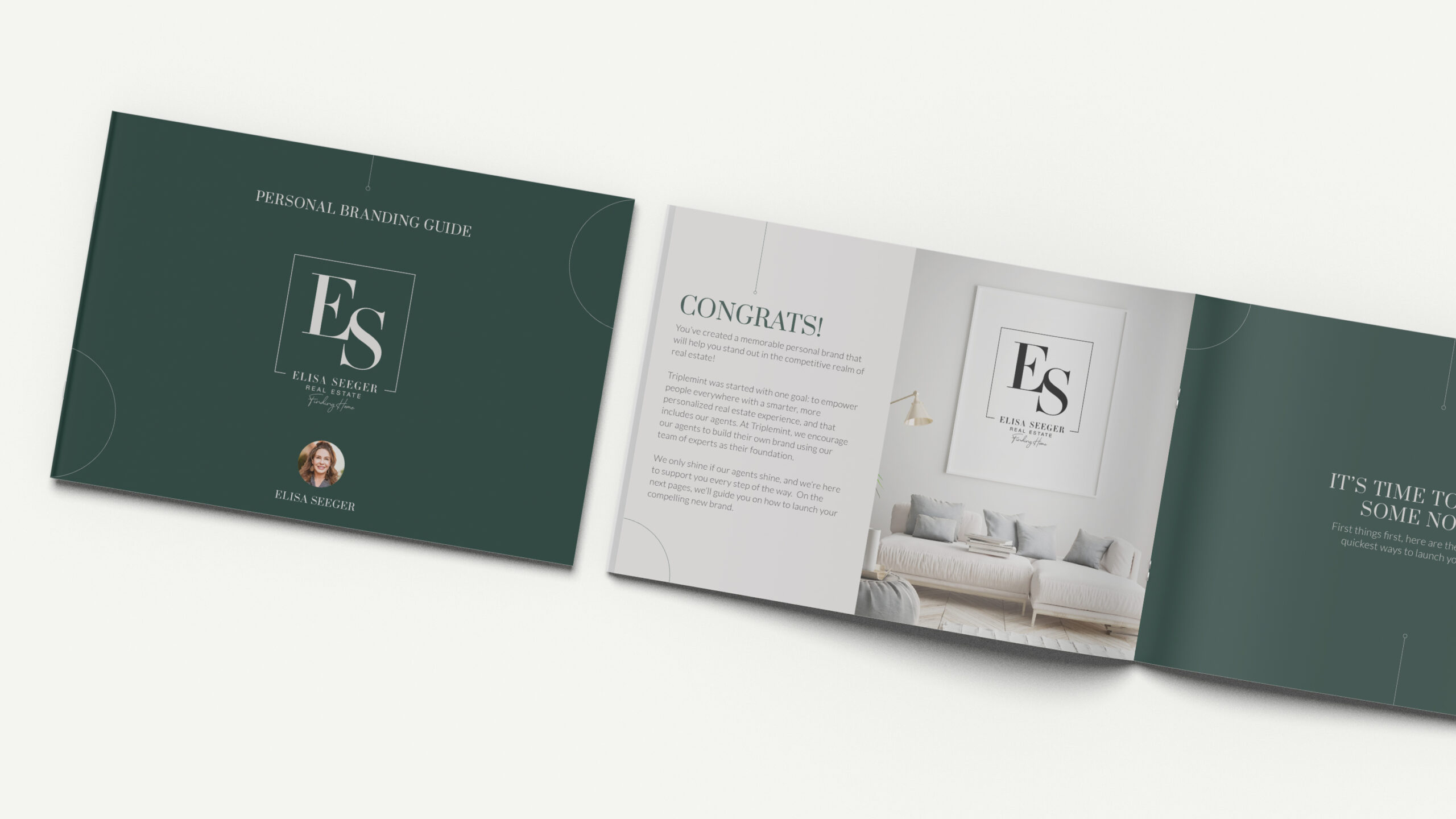
Articulate a clearer aesthetic vision and evolve the brand toward heightened elegance, communicating not only luxury qualities but also a boutique, tailored customer service platform for its agents and their clients.
In Q1 2022, the new branding was launched, and by Q3, we garnered the attention of global real estate firm, The Agency RE, and finalized a merger.
- Brand Foundation
- Logo/Monogram System
- Type System
- Color Palette
- Website
Art Direction: Matt Plaia
Senior Design: Andres Sanchez
Graphic Design: Alejandra Vélez Ocampo, Maddi Wittenberg, Mary Lins
EXPLORATION
Over six months, working alongside focus groups that included marketing experts and real estate consultants, the brand identity was distilled into three key themes: Tech-driven, Heartwarming, and Rebellious. “Tech-driven” emphasized the company’s data-first approach, “Heartwarming” showcased its boutique, client-focused service, and “Rebellious” conveyed its innovative, non-traditional approach to real estate. After testing various concepts with focus groups and refining based on feedback, the result was a luxury brand identity that effectively merged these elements.
TYPOGRAPHY
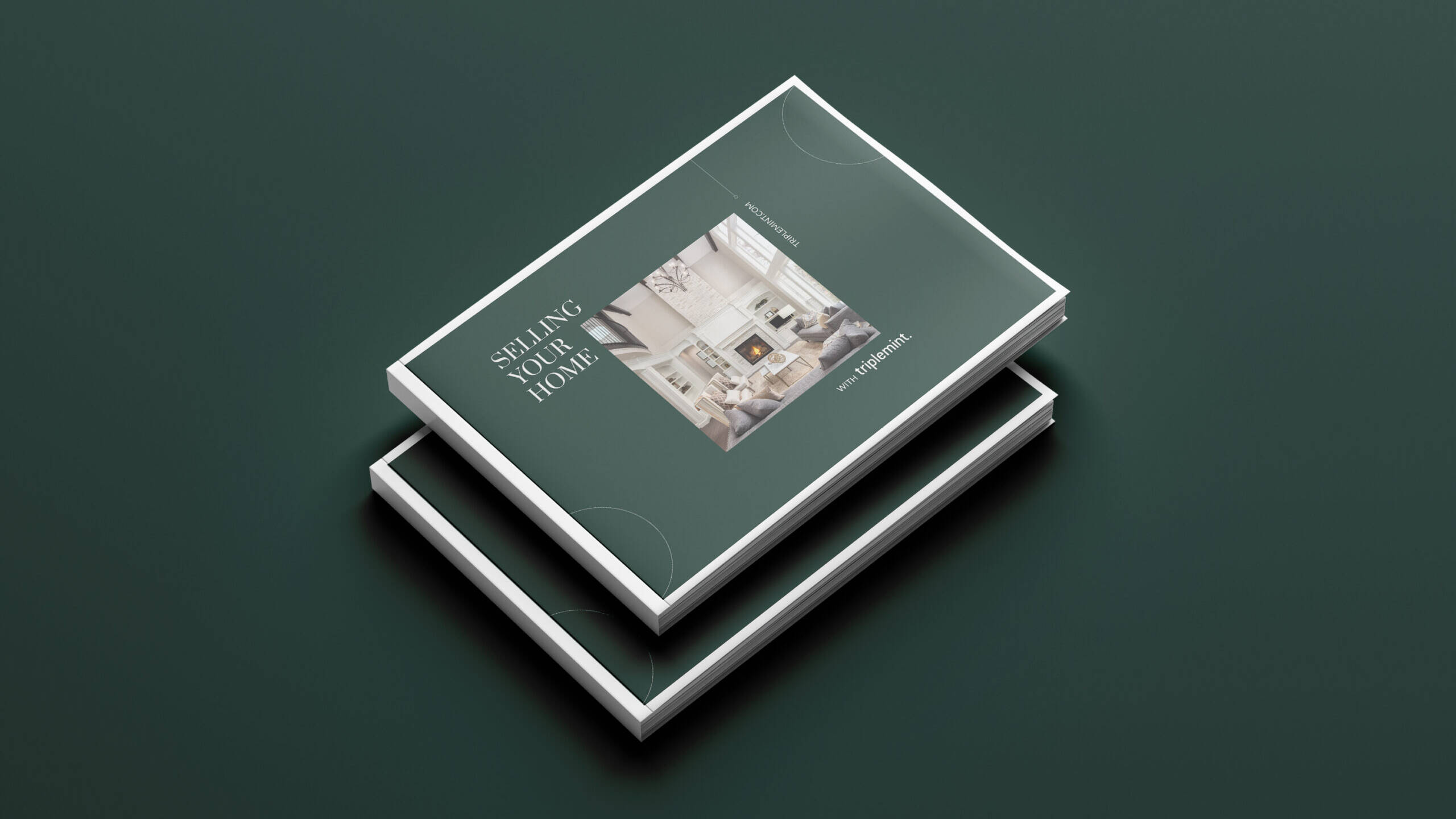
When selecting the fonts for Triplemint’s brand identity, versatility and uniqueness were key considerations, alongside maintaining a luxury aesthetic that reflected the company’s boutique, tech-driven personality. Prata, with its sharp serifs and organic teardrops, was chosen for its striking contrast and refined curves, ensuring optimal visibility across various display sizes. Lato, a sans serif typeface with classical proportions, brings harmony and elegance, offering a sleek yet warm feel that balances stability with approachability—perfectly aligning with the brand’s tone and personality.
COLOR PALETTE
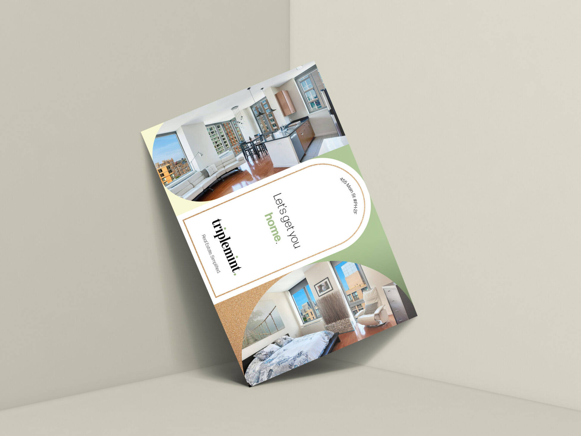
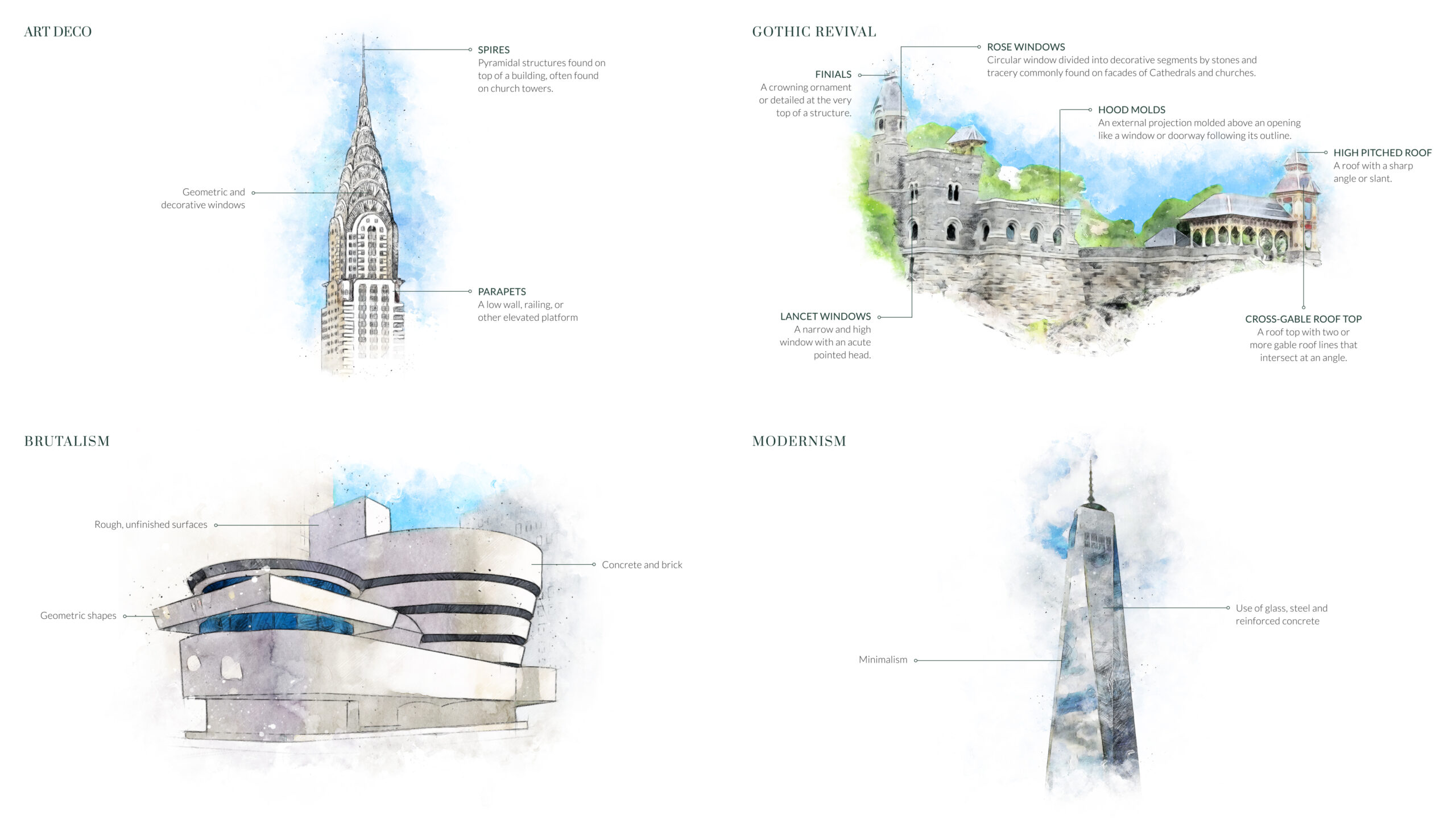
After extensive research, testing, and adaptation, a four-color palette was selected to reflect sophistication, luxury, and evolution while staying true to the brand’s roots. Through focus groups and design research, richer tones were identified as essential. The final palette features deep green and heather gray, symbolizing elegance, prosperity, and the connection between growth and tradition. Watercolor and illustration were added as complimentary features, influenced by natural artistry, and conveying a transparent, sincere approach to real estate, embodying the brand’s role as curators of luxury, comfort, and happiness.
AESTHETIC
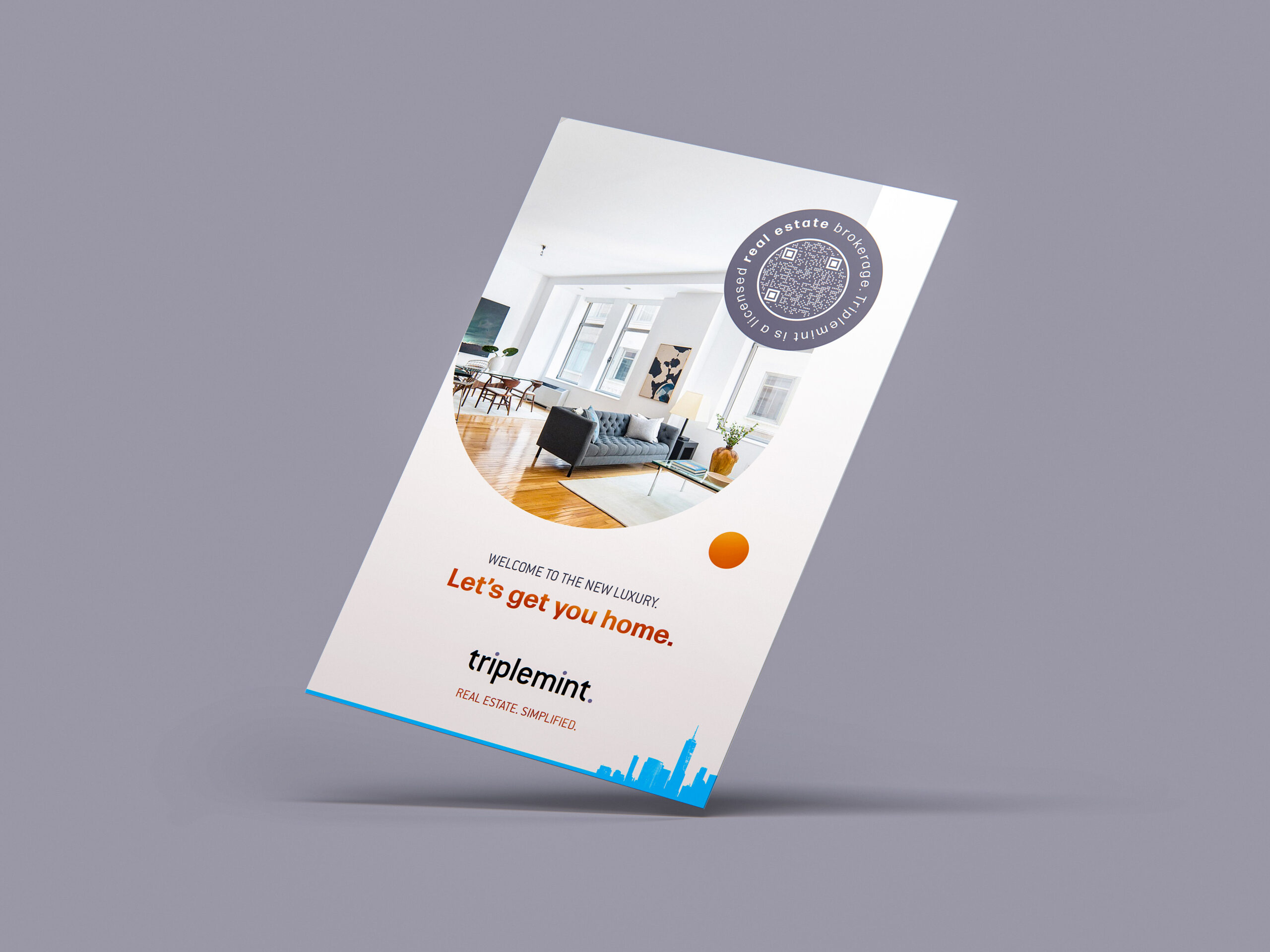
The new brand elements were thoughtfully crafted to stand strong on their own while offering versatility and reinforcing the unique strengths of Triplemint’s agents. The circle, a key anchor in the branding, symbolized balance, integrity, and protection, reflecting the company’s commitment to supporting both agents and clients. The traces, inspired by metro system maps, represented progress and evolution, guiding the brand from Point A to Point B and merging sophistication with approachability.


